
Best Resume Fonts for Print (That Still Pass ATS)
The modern job search is a hybrid game. Your resume needs to look executive-level when it lands on a desk, but it also needs to survive the digital gatekeepers. Here is how to choose typography that wins at both.

The "Double Duty" Challenge
Most candidates optimize for one or the other. They either pick a creative font that confuses the ATS, or a boring system font that looks cheap on paper. You need to thread the needle.

The Robot Reader (ATS)
Applicant Tracking Systems convert your PDF into plain text. If you use non-standard fonts, ligatures, or complex symbols, the parser turns your experience into gibberish (e.g., "M@nager" instead of "Manager").
The Human Reader (Print)
When you mail a Ballista packet, a real person holds your resume. On paper, typography affects perceived authority. Tiny, cramped Arial looks like a terms of service agreement, not an executive summary.
The Best Hybrid Fonts
These typefaces are universally installed (safe for ATS) and designed with high legibility (beautiful for print).
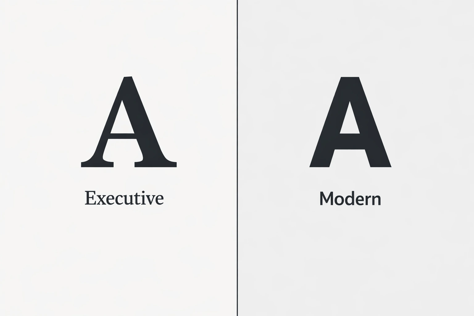
Serif (Traditional & Executive)
Garamond
Executive ChoiceThe gold standard for executive resumes. It saves space and looks incredibly polished in print.
Georgia
High LegibilityDesigned for screens but prints beautifully. Slightly wider than Garamond, making it very legible.
Cambria
RobustA sturdy serif that holds up well even at smaller sizes. Great for dense work histories.
Sans-Serif (Modern & Clean)
Calibri
Safest BetThe safe, modern default. It's unobtrusive and universally readable by every ATS in existence.
Helvetica / Arial
Modern StandardClean, neutral, and professional. The standard for modern tech and creative roles.
Roboto
Tech FriendlyA geometric option that feels tech-forward without sacrificing readability.
Print Specifications That Matter
The font is only half the battle. How you set the type determines whether your resume is a pleasure to read or a headache.
Never go below 10pt. It becomes illegible on paper.
Create clear hierarchy so scanners (human and digital) can find sections.
Printers need bleed room. ATS needs clear boundaries.
⚠️ Fonts to Avoid
Times New Roman: It's not "bad", but it signals "I didn't change the default settings." It can feel dated.
Light/Thin Weights: These disappear when printed on standard office printers and can break during OCR scanning.
Condensed Fonts: Hard for humans to read quickly; letters often merge in ATS parsing.
Ready to make an impression?
We've done the research. Ballista packets use premium, ATS-safe paper and typography standards to ensure your resume stands out on the desk and in the database.